
Logo Design Tips: Why Logo Design for Social is Different
Here are some logo design tips that can help your company look better on social media: make it square, make it bold, and use elements people recognize. These logo design tips help logos get recognized and remembered. This post examines how the three tips we’re suggesting have been employed successfully for years in something we’re all familiar with now: the Periodic Table of the Elements.
As marketers, we often get asked:
“My logo looks weird on Twitter.” “Can anything be done to make my logo look better on social media?”
These problems stem from the use of old fashioned logo design. Many businesses still use thin, landscape oriented, logos. Although this type of logo is impactful when given enough space, meaningful in web design real-estate, it can lose its voice within the confines of a Twitter or Facebook square profile photo.
Many brands have turned to a simple solution for this problem – Create a bold icon version of their logo.
What are the New Considerations For Logo Design?
Consider this example of a brand’s logo shown below:
Note that it looks fine if viewed in the intended resolution.

Problem:
Now look at the image as it appears on Twitter feeds. Is it easy to read or difficult to decipher what exactly is in the logo box?

No. It’s too small. You can’t recognize it at all.
Solution:
A second version of the logo was created to solve this problem using iconography instead of using the exact brand logo.
![]()
The result is a clearly identifiable branding symbol that can be understandable across the social platforms while maintaining the brand identity.
What the Periodic Table of Elements Reveals About Logo Design
Everyone has dealt with the Periodic Table of Elements at some point in their life and have had to memorize the element names according to the abbreviation. For a long time, before the development of the Periodic Table, chemical substances had shorthand symbols that were used by chemists in lieu of writing the full name of the substance out. Dalton tried to refine and make official the use of shapes in circles, a convention used centuries before. This proved to be no more easy to memorize, write or recognize.
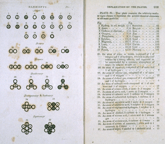
Dalton’s Symbols. credit wikimedia.org
Although it Dalton’s system lent itself to cool diagrams that were close to to how he envisioned the molecules being configured as bunches of balls, it really wasn’t easy to write, print, or say. It was a great system if you were already a chemist, but hard to learn and use to communicate if you didn’t have the benefit of a degree in chemistry to make sense of them.
It was the chemist Berzelius, who knew enough about people and what’s practical to expect from them, who is credited with using letters to represent elements. They could be printed, written and spoken with far less effort in translation.
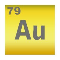
Look at the Periodic Table of Elements below that features the abbreviated elements instead of the full names.
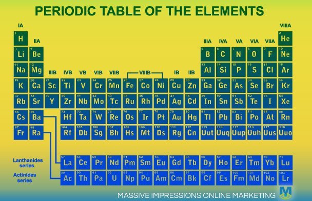
By using abbreviations or symbols to represent the elements, the table has provided an easy-to-understand way to present the elements, plus it arranges them into square boxes.
When two letters appear inside a square box, everyone thinks it’s meant to be a chemical symbol. This leverages people’s existing familiarity with letters, and just re purposes them into recognizable “logos”. In this case they’re just put in a square box. That’s all it takes for the recognition that it represents a chemical element.
Square Your Logo for Better Recognition
Squaring your logo is even more important today more than ever. Social media sites show your logo in a square. What’s ideal is having your logo take up as much of that square space as possible, so it’s more easily recognized. This next example demonstrates that.
Eliminate the extra baggage.
A great logo doesn’t need to have wispy, swoopy lines wrapping around it in an effort to be high-tech or “edgy”. What makes a great logo effective is its simplicity. Chemical symbols aren’t flashy, but they get recognized, they get written, they even get spoken. When it comes to developing a logo for social, think simple, think square and think about recognition.
Our Company’s Logo: We Used Symbol Elements, Making it Elemental for Social
Our “classic” logo is the logo you see at the top of the site. It is rectangular and landscape oriented. Our name isn’t short enough to fit into a square and be legible adjacent to a tweet.
Use Elemental Symbolism
Elemental symbols, symbols that are easy for people to write and say, aren’t limited to letters. The second version of our logo that we created about a year ago is a good example of a use of an recognizable symbol being used to create a square, social friendly logo version.

Our second version of the logo has simply the M from our classic logo and the eye symbol from our logo fit into a square. It reads “M-eye” which is phonetically the same as saying our initials “M.I.”, almost as simple to recognize and say compared to our earlier example.
We recommend companies invest time and effort into developing logos that will get recognized. This means looking forward at how future audiences will interact with the brand. This means thinking digital and thinking social rather than being constrained by printed designs of the past.
