
Responsive Email Design: Why is it Driving the Rebirth of Email?
For a long time email design has been stuck. Emails became boring while the rest of the web became more exciting. Archaic design limits, put in place more than a decade ago due to security issues, kept email designs from maturing along with digital audiences’ expectations. That’s changing now. Emails are poised to get sexy again thanks to responsive email design.
For more than a decade, email design has been waiting it’s time in a bare concrete holding cell. Artists and designers have learned to keep their heads in the box when it comes to making emails that are both attractive and effective at getting response.
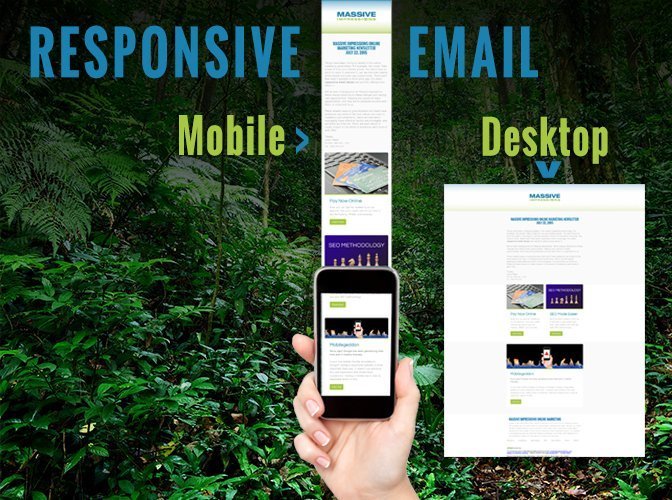
Thankfully, things are changing. Now great looking emails can be designed that are comfortable to receive and read on any platform. Now our emails can truly fit our devices. The approach to creating emails that look great across various devices is called responsive email design. It refers to the ability of the email contents to format themselves dynamically, making the presentation highly readable, especially on mobile devices like tablets and smartphones.
Today, people are looking at emails first and foremost on mobile phones and tablets, not desktops.
According to Movable Ink’s Device Preference Report, 2/3 of emails get opened on smartphones and tablets first.
Smartphones and tablets combined accounted for 66% of all email opens, up 2% from 64% in 2013.
 Email has always been a challenging medium to communicate with because you’re competing with messages that are more direct, personal, and expected. It’s always been a very effective online marketing tactic because the message you’re sending gets mixed with messages that are more direct, personal and expected. It’s never going to lose it’s lucrative appeal to marketers, simply because it’s going to continue to be effective. Having an email address is a necessary factor to doing just about anything on the web today, so even folks who don’t like email have to use it.
Weak design doesn’t help make recipients any more happy about getting emails, particularly when the experience is so poor relative to the other online attractions on the web and on smartphones in apps. Compared with what people experience in apps and on social media websites, opening a traditionally designed email has developed into a traditionally disappointing experience, particularly on mobile devices.
Why does email suffer from design restrictions?
For the last decade, there have been restrictions on what you can get away with across all email readers, mobile or desktop. When it comes to coding emails, actually getting into the HTML and tweaking the layout, for the last ten plus years you’d have to limit yourself to what worked back in 2003! You can’t put video in an email, nor can you put Flash, or a form, or even the simplest “image-changes-on-mouse-over” effect. The reason why is because back around that time, bad guys were embedding bad things directly into emails, stuff like viruses and malware. The spartan design rules were put into place to prevent bad guys from sending you an email that would take over your entire computer. It was a necessary limit, but it really made design come to a dead stop.
The technology people were using, by default back then in 2003, was different than what we have available to us today. Back in 2003 mobile phones were around, but none had the capacity to show HTML emails. Outlook, Microsoft’s email reader program distributed as part of the Microsoft Office Suite of Tools, is the email reader that businesses installed by default on employee workstations, all around the world. It was hard to find a computer being used by a business that didn’t have Outlook installed. Outlook set the pace for all B2B (business to business) communications. There’s never really been much of an upgrade in terms of what the lowest common denominator, Outlook, is willing to parse.
As an email designer you knew you could make emails that looked good, but you didn’t have the power to make them look great. Designs that looked good and would get clients excited often flopped when received when compared to the low design, easy-to-read versions. “What’s the point of making them look good if they have to be mobile friendly?” we used to lament as the cold reality of the click-through comparisons sunk in.
The Changing Environment of Email in 2015
 As the web evolved, email design limitations grew while the rest of the web rushed forward. When web page designers started developing sites that reacted to the small screen sizes, email designers were left in the cold. They had to follow their 2003 rules. This is changing quickly now thanks to smartphones putting more modern email readers literally in people’s hands. Outlook is no longer the default means to view and receive email. That alone changed the environment for email.
Now It’s About Responsive Email Design
Up until now, emails have had very little ability to conditionally format themselves. They couldn’t fit dynamically into the viewing window in the same way that websites do. Most emails, unless they were very simple text only emails, required the recipient on a mobile phone to pinch and zoom in.
Responsive emails look great on mobile devices and on desktop browsers, allowing designers to once again get fancy with their audience’s attention. There’s no pinching, no zooming. The fonts get bigger when viewed on mobile devices, but stay as small as they’re supposed to look on desktop viewers.
A brand’s best chance to make a first impression is going to be on a mobile device. Many people only look at an email on a smartphone and never look at it again on their desktop. If the email isn’t responsive, it’s not going to look as good as it should for the majority of your recipients. If it’s not responsive it’s got a lower chance of getting attention today.
Is This Something We Be Doing Now With Our Emails?
Yes, of course! If you’re not sending responsive emails, you could definitely do better, and get better results if you sent them. Not that many brands have begun to leverage responsive email, most marketers haven’t even heard of it. The truth is that you should have been sending responsive emails yesterday. As marketers we should we should always be looking for opportunities to be more effective.
Lots of marketers who experimented with new techniques will tell you that it’s often a good idea to wait until a concept matures before beginning to leverage it. Don’t listen to them. They’re just saying that because they got discouraged when success didn’t come as easy as they expected it. They may have given up too early to show a return on their experimental investment, or just weren’t savvy enough to leverage it towards a return. New techniques and approaches in marketing are often the most lucrative to leverage. Audience attention is focused and other businesses are slow to react. During these times when a new approach or tactic emerges, the first movers gain an advantage. They gain the advantage because their presence gets attention absent competition.
Will Leveraging Responsive Email Design Give My Brand a First Mover Advantage?
Sure, responsive email design is definitely one of those tactics that can get your message more attention than your competitors. Changes within the online marketing industry are making it more practical to consider. So now is the time to go for it!
Designing an email campaign that’s actually going to succeed is a strategic challenge. Coming up with an effective email design has always been both a tactical and technical challenge. Designing a responsive email is even greater level of technical and tactical challenge. There’s not just one viewport to consider – there’s several.
Achieving the ability to actually send a responsive HTML email design out and retain its responsive properties is an even greater technical challenge. Many email service vendors simply cannot send responsive emails because of their own mechanistic restrictions or restrictions they place on designs.
It’s possible to demonstrate responsive sends with Constant Contact, something our firm and other marketers have demonstrated empirically already. Although we don’t have any direct experience sending through MailChimp yet, it’s often referred to by responsive email designers as a service that facilitates responsive design. This isn’t the kind of feature we know of any service vendor offering through their native templates yet, so HTML experts are still necessary for creating the designs, loading them into vendor systems and testing them.
If you want your brand to stand out, and your message to get heard through email, make it readable. If you don’t maximize it’s readability for the folks holding it right in the palms of their hands, you’re missing out. Don’t let that opportunity to connect become an annoyance and get swiped away. Make the experience easy to understand; make it easy for your audience to respond by using responsive email design.


Leave a Reply
Want to join the discussion?Feel free to contribute!